A structural, editorial identity for a boutique architecture studio — closer to a cultural publication than an agency site.
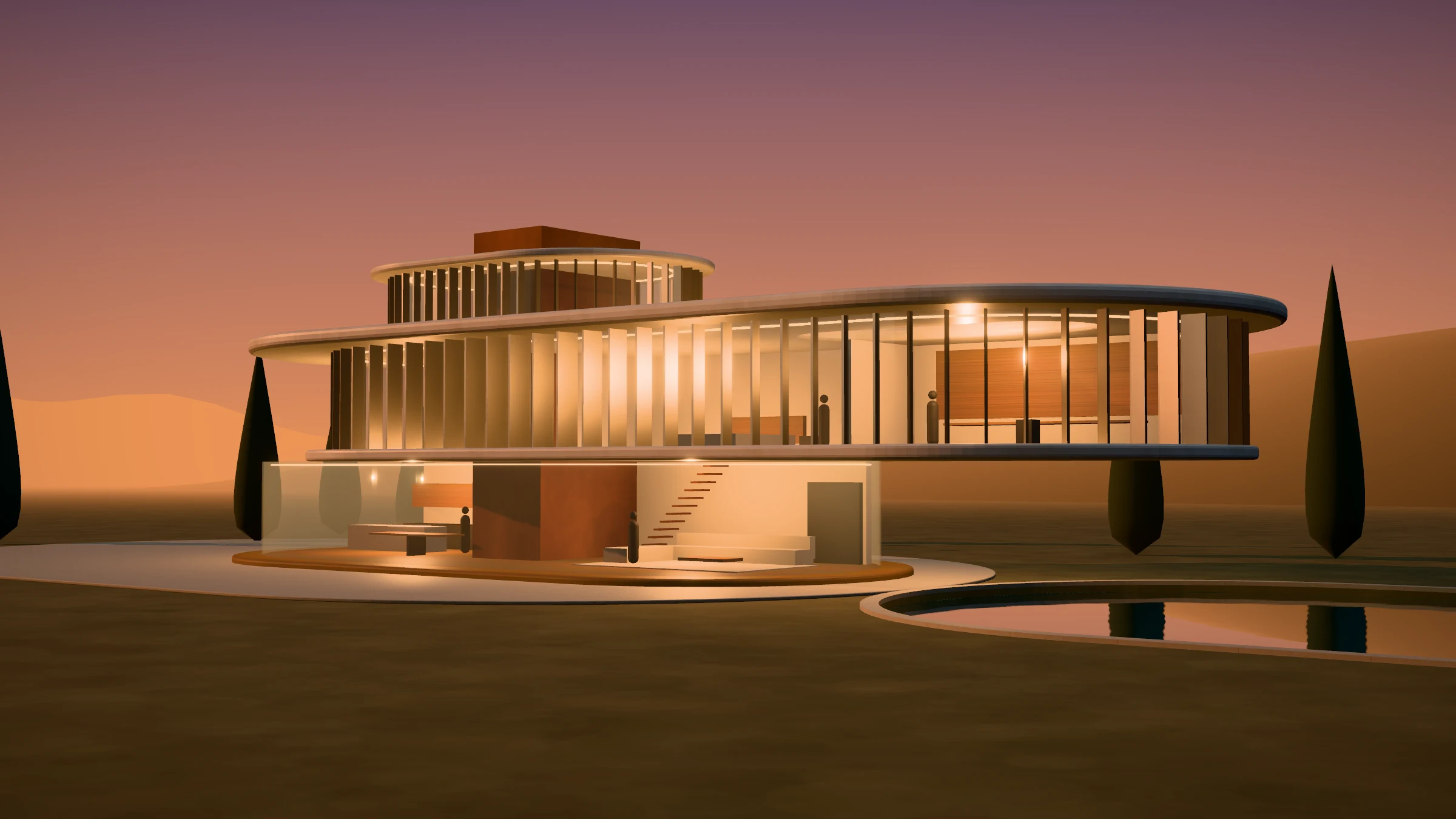
Three plates, one core
Oval floor plates stacked off-axis above a reflecting pool. The upper level runs eleven metres past the ground floor and the roof blade shades both, so the house seems to hover at the edge of the water.
- Area
- 610 m²
- Cantilever
- 11 m
- Levels
- 3 + lantern
Visual Direction
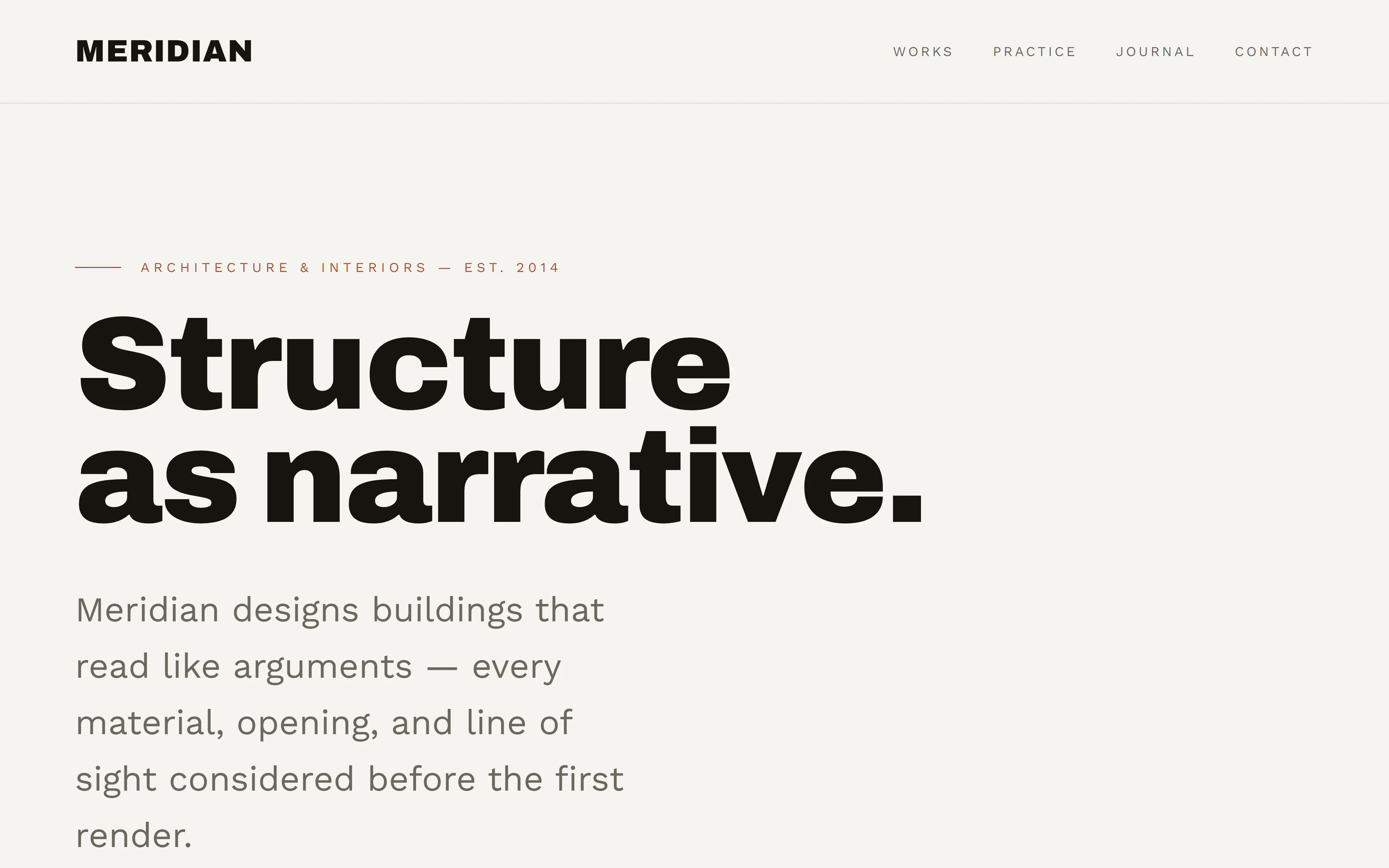
No stock photography — the identity is carried by type, a strict grid, AI-generated concept renders and white-card models of each building that visitors can turn. The intent is restraint: a reader should feel like they're paging through an architecture annual, not scrolling an agency homepage.
Archivo at its heaviest weight for every headline — blunt, structural, closer to signage than to a typical display serif. Work Sans carries every supporting line at a much quieter register, so the two never compete.
Typography
Palette
Warm paper (#F5F4F0) and near-black ink, with a single rust accent (#A8522E) kept for the eyebrow rule, links and the one element each model is about.
The Works Index
Layout Logic
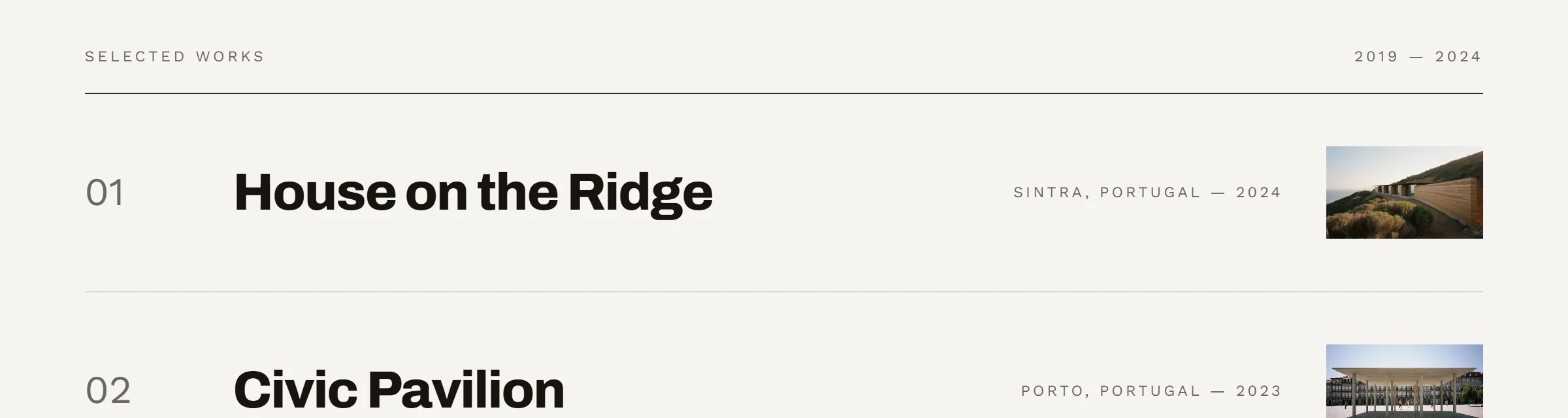
A numbered index (01–04) is the spine of the page — location and year run right-aligned in a fixed column, echoing how architecture monographs list a firm's built work. A single featured project breaks the grid at the end with a large model image opposite its text.
Deliberately quiet on the page, generous where it counts: each index row opens a model the visitor can turn, so a claim like "a roof on twelve columns" can be checked by counting them. Nothing moves until someone asks it to.
Interaction
Demonstrates
- Editorial grid systems
- Typographic hierarchy
- Restrained art direction
- Whitespace composition